coffee-shop class #9: wrap-up
10.15.08 | coffee-shop
class
a few hours ago, a few local denver photographers
assembled for this month’s coffee-shop class to explore
a bit more about lighting with video lights
then creating the resulting photoshop
composite. the idea was learning how to do
more with less, using a pair of simple $30
video lights. each subject was lit with two
lights, each held by a human.
a few things we learned:
- when using video lights, maintain equal distance to subject, otherwise the lighting ratios change. hence, thus, and furthermore, if you are shooting on a series of images in manual mode, subject exposure will vary. note to self.
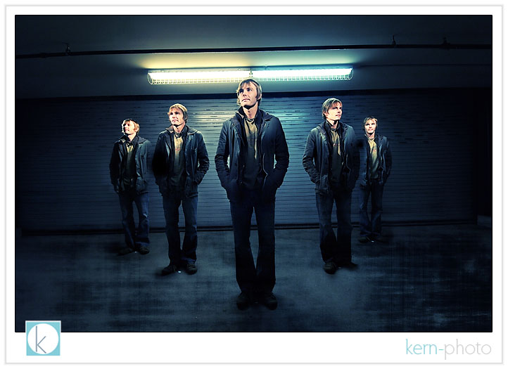
- pre-visualization is helpful to avoid overlapping subjects that could create more post-processing work (note the left shoulder of kevin featured on the far left... see how it overlapped = more post-production in the end. the goal is to keep it simple and capture as much in camera as possible. in the below shot, kevin was a human bowling pin.... as we set up the shot, it placed small pieces of paper so he knew where to stand (note three white dots near his feet)
- pre-visualize with intent. don’t forget to ask yourself WHY. the possibilities are limitless.
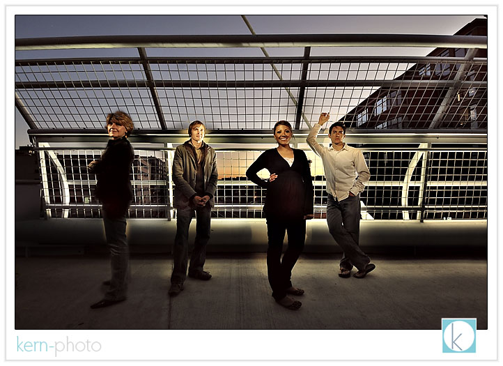
- shoot with a consistent ambient background light. the slightest change will make post-production a pain (see the second image below).
- don’t forget to shoot the background as intended. otherwise, you will be left with fewer options for background layer manipulation.
- a tripod makes the photoshop compositing a breeze.
- a single flashlight does not work as well as two small video lights. the added diffusion and fill from a second light sources helps to remove harsh shadows.
the basic idea is that this is actually SIX photos (5 of kevin and one of the background), then each was pasted as a new layer and then a layer mask was applied on just the area of interest (i.e. the subject in each pose). the resulting layers were merged into one.
kevin von qualen’s band shot:

folks who do not know kevin... he really doesn’t have a band, but if he was able to clone himself four times over, the above shot is what *they* could look like :)
the coffee-shop class photo, featuring trish eberlin, kevin von qualen, vanessa kruse, and moi (leff to right):

one thing we learned from this shot was that the ambient light was changing very quickly, so when we took each of the composite shots, the background changed every so slightly to render the odd-fake look in the sky. if i spent a few more minutes in photoshop, i could have cleaned it up... but then you wouldn’t see what i’m talking about.
a few things we learned:
- when using video lights, maintain equal distance to subject, otherwise the lighting ratios change. hence, thus, and furthermore, if you are shooting on a series of images in manual mode, subject exposure will vary. note to self.
- pre-visualization is helpful to avoid overlapping subjects that could create more post-processing work (note the left shoulder of kevin featured on the far left... see how it overlapped = more post-production in the end. the goal is to keep it simple and capture as much in camera as possible. in the below shot, kevin was a human bowling pin.... as we set up the shot, it placed small pieces of paper so he knew where to stand (note three white dots near his feet)
- pre-visualize with intent. don’t forget to ask yourself WHY. the possibilities are limitless.
- shoot with a consistent ambient background light. the slightest change will make post-production a pain (see the second image below).
- don’t forget to shoot the background as intended. otherwise, you will be left with fewer options for background layer manipulation.
- a tripod makes the photoshop compositing a breeze.
- a single flashlight does not work as well as two small video lights. the added diffusion and fill from a second light sources helps to remove harsh shadows.
the basic idea is that this is actually SIX photos (5 of kevin and one of the background), then each was pasted as a new layer and then a layer mask was applied on just the area of interest (i.e. the subject in each pose). the resulting layers were merged into one.
kevin von qualen’s band shot:

folks who do not know kevin... he really doesn’t have a band, but if he was able to clone himself four times over, the above shot is what *they* could look like :)
the coffee-shop class photo, featuring trish eberlin, kevin von qualen, vanessa kruse, and moi (leff to right):

one thing we learned from this shot was that the ambient light was changing very quickly, so when we took each of the composite shots, the background changed every so slightly to render the odd-fake look in the sky. if i spent a few more minutes in photoshop, i could have cleaned it up... but then you wouldn’t see what i’m talking about.
