New Blogsite!

Welcome to my new blogsite! Yes, this very website you are reading is a collaboration of weeks of work with Lindsay Landis at Purr Design.
Why a blogsite?
It’s like a blog and website in one. It makes it easy for viewers to see my latest work and book me.
My blogsite reminds me, “R. J., you are only as good as your last shoot.” This self-imposed pressure ensure I deliver consistent high quality on each of my shoots. I don’t want to do the same thing over and over. There’s no creativity in that. Photography should fall under the art department, not business school. A blogsite remains not only my favorite way to share my work, but to keep myself accountable that when client’s high me I’ll be creating images I’m proud to share.
I blog all my shoots. I’m open and don’t mind sharing my thoughts, struggles, accomplishments, and highlights from my personal life. It has been very important my photography business over the last 6 years (I’ve managed to click publish 400 times), yet I don’t want to stagnate. The web world changes at a rapid pace and I want to leverage the latest technologies available specific to browser capabilities, viewing experience, search engine optimization, and branding consistency.
What’s stayed
It’s still me, R. J. Kern. The same energy. The same creativity. The same enthusiasm. But a much cuter packaging (that’s what my wife would say).
I’m a photographer first, a writer second. Thank goodness a picture is worth 1,000 words! Writing comes very difficult for me. I don’t write with beautiful prose with flowery adjectives. Yet, I share my open heart with my clients. The resulting images are the product of the process. I also don’t mind sharing advice to clients and secrets with fellow photographers. I’m direct. I’ll tell you what I think in meticulous bullet points. I love nerding out on technicals and researching and sharing my results right here on my blog (you’ll find over 100 posts in my photographer resources section here). I’ve managed to blog 412 posts in 3.5 years, averaging to about one post per 3 days. That’s a ton of my life spent typing on this very computer, yet I feel my clients find the investment an easy way to understand me and my work.
What’s changed
Navigation has been simplified, polished and true to my brand. In the image above you’ll notice the three components:
- Main menu. 10-15 images will rotate through my favorite images over the years and I expect I’ll rotate these out every quarter or so. Just above the slideshow, you’ll find links to my portfolio including Romance (Weddings & Engagements), Portraits (Families, Dogs, kids), and Happenings (Announcements, Personal stuff, etc).
- Square Thumbnails. These link to individual blog posts. And there are a ton (412 and counting) and cover the range of blog categories (weddings to personal).
- Call to Action / About. I want to make it easy for clients to book me and don’t want them to hunt through pages to contact me. I’ll usually pick up the phone on the third ring or respond to emails with 24 hours during working hours.
Revised Logo
You might notice a few changes, including a few steps in rebranding. My goal was to simplify. My new look, sans color:

Overall, I feel the new look represents a vision I’ve had in my head for some time: lead with a clean, simple design both intuitive and smart.
Since much of my work relies on color and light, it made sense to shift towards a neutral branding to compliment my photography. I want viewers to see my work first, website design second. Therein lies the beauty of intelligent design. This concept ran through my head a lot in every aspect of my business, down to the design of my client USB thumdrives and packaging I share here and the 22 branding tools in my marketing arsenal I blog about here.
On Working With Purr Design
I decided to continue using a customized wordpress website to keep years worth investment of my blog posts. Whew! I can tell you stories of peers who haven’t had nearly the positive experience as I’ve had working with Purr Design. And if you are lucky enough to land on their production list, I highly recommend working with them!
I’ve worked with with Lindsay for years and she’s inspired me my her creative designs, mad blogging skills, and her successful entrepreneurial endeavors. She’s a not only a talented web designer, she runs the amazing Love & Olive Oil blog which showcases her amazing food photography and recipes. She even just came out with her book, The Cookie Dough Lover’s cookbook.
Her husband, Taylor, is an equally-talented creative focused on custom tailoring. You should check out his website, Taylor Tailor. He’s on a mission to create his entire wardrobe from scratch and chronicles his adventures. One day I hope to don threads from his craft & art (hint, hint).
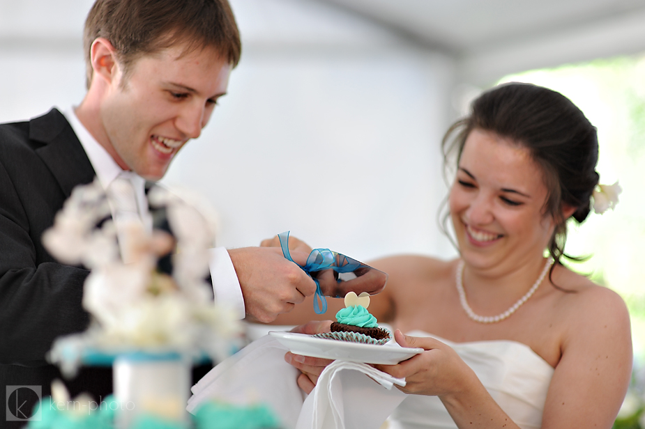
Cheers to both Lindsay and Taylor! Let’s cut that cupcake just like on your wedding day!
PS- Friends and Family Tip : If you’d like to follow my blog easily and view on a Mac, I recommend : 1. Click this link to my RSS feed. 2. Check the box “Show in Inbox” 3. Watch the updates appear in your Apple Mail. I find this the easily way to follow blogs. Most blogs will have an RSS button that looks like a sideways Wi-Fi icon like the one just below the email newsletter box on the bottom of this page.


2 Responses to “New Blogsite!”