The Sandwich Method
Introducing my new favorite recipe of light: The Sandwich Method. Looks like a million bucks, yet doesn’t cost $8,000. And it’s yummy.
When I stumble on this kind of glamour lighting setup, especially in an abandoned railroad car, you might hear white fronted capuchin monkey sounds like, “Ooo ooo ooo.” Clients don’t get my enthusiasm until I show them their photo in said lighting conditions. See?!?! a picture really is worth a thousand worths!
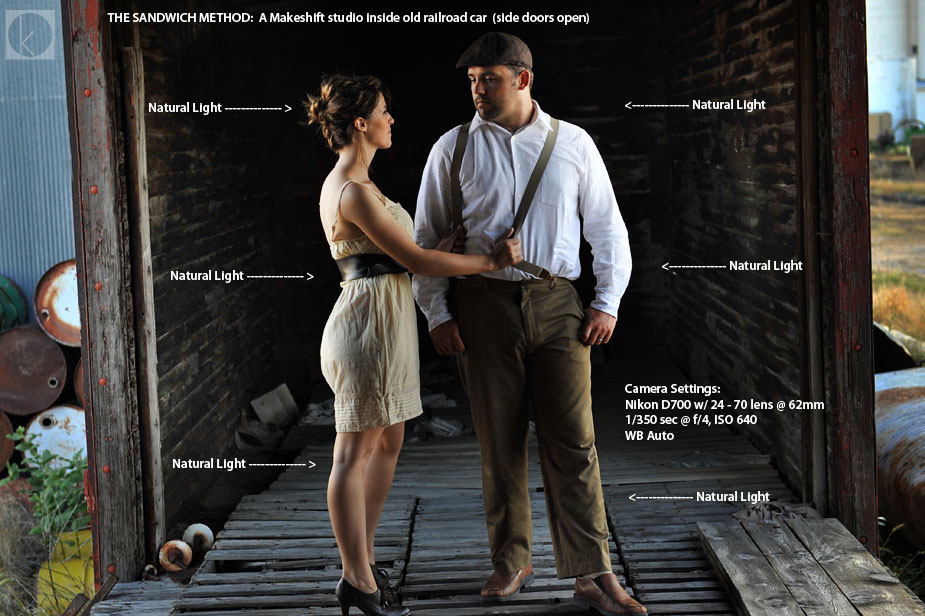
I stumbled upon this natural lighting scenario in an when shooting Scott & Alyssa’s portrait session. What a find! I couldn’t have set my Alien Bees up to make this look any better.. that is the beauty of natural light.
What amazed me the most was the sheer quality of light… on par with a studio lighting setup – in an unsuspecting location. Which is a great reminder to keep your eyes peeled for similiar scenarios on your next shoot.
What is this Sandwich Method you speak of?
Sandwiching your subjects together with light coming from 180 degree opposite directions sculpts shadows where you’d least expect to create a shadow: dead center in middle of your subject.
Think of the light as a vertical slice of bread. Take two slices (light facing each other) and have your subject stand equidistant in between the two light sources. If you move closer to one, that light will appear slightly brighter, while the other will loose effect.
Can I do the same with flashes?
Yippers, This lighting recipe works well with any light, either artificial or natural. Natural is just cheaper. However, to pull this off in an artificial lighting world: you’ll need duplicate equipment to achieve the same look (costs x 2) plus some VERY large lighting modifiers like this 74” Octa powered by an Elinchrom Ranger would do the trick.
Where to find it a cheaper version of this sort of light?
If you like your lighting on the cheap, you’ll need to hunt to find the goodness.
Here’s a visual of what to look for: think of your shooting space like a square box with the sides cut out allowing light to pass through like your hand through a box you are assembling. The dark foreground, background, top and bottom create the necessary darkness to create shadows.
In the real world, to find your very own sammich lighting, look in places which have covered sidewalks blocked by walls, inside buildings with glass walls, or under a small patio with two openings. Use your imagination. Or head to your nearest abandoned rail yard with permission, of course.
Why is this sexy light?
Look closely and you’ll find the clients are lit from only two directions… which create the shadows which define shape (kinda like a good sauce makes a dish). The lighting are exactly the same from each direction, which marriage well together with my couple. Personally, the quality of light makes this photo, location second, and composition third. The emotion is there, too, along with some groovy suspenders. The dark background creates needed contrast to see Alyssa & Scott, otherwise which could be swallowed in vapid darkness to the liking of Edward Cullen.
What’s the culinary equivalent?
Maggiano’s family style Italian dining, most likely in the realm of my favorite Rigatoni D (recipe here). Quality, quantity, value, comfort, and love all wrapped into one.
I chose to zoom out so you can see the source of the light, which adds nice context to our surroundings… wish there was a grassy horizon with Black Angus grazing.

If you see a photo you like… ask yourself, “How would shake it up and make it different?” Small things make a big difference. Shake it up. Even IF it is a polaroid.
“If I saw something in my viewfinder that looked familiar to me, I would do something to shake it up.” – Garry Winogrand
__________
You also might like :
How to Choose Your Best Photos
On-Axis Fill using a Ring Flash
11 Tips on Getting the Most of a Photography Workshop


Pingback: Staging Foregrounds {creative tutorial} | Kern-Photo
Pingback: The Hit List: 33 Photo Tips & Tutorials from 2011 | Kern-Photo
Pingback: #95… check {Strobist Feature} | Kern-Photo